Episode 4. Miryoku layout
Although it’s not a physical keyboard, the Miryoku layout deserves it’s own episode. The ideas from here enable such tiny and elegant keyboards such as the Corne LP.
For convenience, here is the chart of the Miryoku layout:
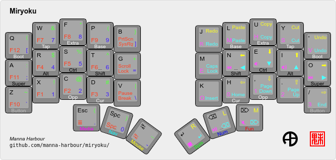
Reading the chart
Miryoku collapses all keys into a 3×5+3 layout. It’s so elegant!
The glyph in black is the main glyph of the key. When tapping that key with no other modifiers, the keyboard sends the signal for the main glyph.
When long-pressing a key, the modifier is activated. For example, to type a capital N, I hold the T key on my left hand, and then tap the N key on my right hand.
Layers
The glyphs in green, blue, red, yellow, pink, and cyan are on different layers.
For example, to type !, I long-press the return key on my right hand, which activates the green Sym “Symbols” layer, then tap the X key on my left hand.
Learning it
It didn’t happen overnight! I kept the chart open on my iPad for quick reference. It wasn’t easy, and I sent several messages accidentally on Slack or Zoom. I would say after about three weeks, I was comfortable enough to know for sure I was never going back.
And after learning Miryoku on the Sofle v2, all those keys that were outside the 3×5+3 layout felt so extra, so unnecessary. Clutter.
My fork
Miryoku is fantastic, but I did make a few edits. My QMK fork is on GitHub at github.com/FullQueueDeveloper/qmk_firmware. It has a fullqueuedeveloper branch the fullqueuedeveloper keymap for the crkbd folder (Corne keyboard). The README.md has more information about my take on Miryoku.
Conclusion
Miryoku opens up new possibilities. It shows how a 3×5+3 layout is possible. It’s so elegant. It makes me happy.